NOTE: I no longer recommend SiteGround. Instead, I choose NameHero Hosting. It wasn’t an easy decision, but I stand by it. The loss of cPanel is a big deal, and SiteGround renewal costs are now simply too high to ignore after their deceptively deep discounts for the first year.
At the end of July 2019, SiteGround announced that it was migrating to a new interface and leaving cPanel behind. They’ve been working on this for some time, and my guess is that they chose to release it at this particular time because of the latest cPanel price increases announced on the 27th of June 2019. These changes come soon after what would have been a significant cost increase for SiteGround.
Existing users will be migrated to the new interface in September 2019, but new users will get access to it right away. Here’s a review of the new SiteGround cPanel replacement, and how it will affect your workflow.
What If You Still Want cPanel?
If you absolutely want cPanel, I suggest you check out NameHero – a web host very similar to SiteGround. They have:
- Server caching on all their plans
- Free backups, snapshots, and restores
- Free malware scanning, and more.
Here’s the list of NameHero coupons. This is their best deal:

Here are the main features of the SiteGround interface.
1. Focus on the Website Instead of the Hosting Account
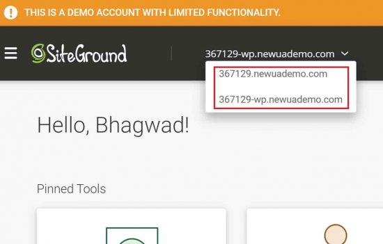
The biggest change in SiteGround’s new interface comes with its focus on websites instead of hosting accounts. Previously when you logged into cPanel, it gave you all the available tools for your hosting account. Now, you choose which site you want to work with from a drop-down box as shown here:

This will improve the workflow for some activities, where you previously had to specify to which site your actions applied. For example, previously in the “Error Log” section of cPanel, you had to choose the site. Now with the new interface, it automatically knows which site whose records you want to look at because you selected it in the beginning.
The same goes for other tools like staging. I won’t say that this new system is better or worse – but it’s certainly different. A lot of customers think in terms of sites instead of hosting, and for them, it’s a simpler workflow.
2. Pinned Functionality at the Top
cPanel can be very confusing for a new user not accustomed to web hosting. While it’s powerful, the flood of icons is intimidating when you don’t know what they’re all for. To combat this, some web hosts like Bluehost and Hostgator present the user with an initial, simpler interface, and then allow the user to access cPanel separately if they choose.
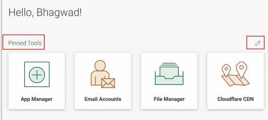
SiteGround solves this problem by introducing the ability to “pin” certain functionalities to the top of the dashboard like this:

Since we all use only a small subset of cPanel tools anyway, this will put all the important and most often used ones right at the top where they’re easy to access.
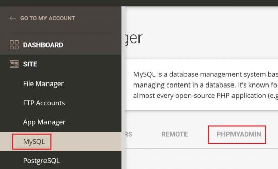
My only gripe is that there are now some functions that are locked away behind others. For example, previously I could click the “phpMyAdmin” icon directly in cPanel. Now I have to first access the “MySQL” area before being able to access phpMyAdmin like this:

I’m guessing that there will be quite a few other pieces of functionality that will require two clicks to access instead of just one. But as SiteGround learns, and the interface evolves, they’ll keep tweaking this till they get it right.
3. A Tool Finder with a Search Box
When Site Tools first debuted, there wasn’t a search box to quickly access tools. Instead, users had to test each probable section to find the feature they wanted. In an earlier version of this article, I mentioned the lack of a search tool as a big drawback of Site Tools.
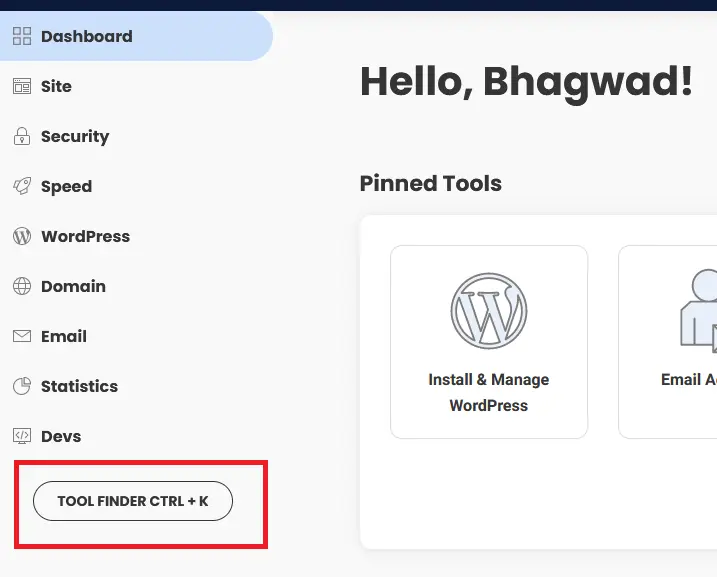
Since then, however, SiteGround has introduced a new tool finder that users can quickly access using the keyboard shortcut Ctrl+k. Here’s what it looks like:

Unfortunately, the interface doesn’t identify every tool. For example, if I wanted to access phpMyAdmin, and used the tool finder to type “php”, it surfaces the general PHP and MySQL page but doesn’t allow me to open phpMyAdmin directly. Still, it’s an improvement from what it was before.
4. No Need for a Separate Mobile App
The older cPanel interface wasn’t designed for mobile devices, but the recent updates have fixed that. Similarly, Site Tools displays nicely on mobile phones, so there’s no need for a separate app to access your SiteGround backend.
The new SiteGround interface is designed with a mobile-friendly theme in mind. This means that you can log into the website from a tablet or a phone and still have the same experience that you get on the desktop.
5. Ability to “White Label” your Client’s Sites
This is a very cool functionality that a lot of web designers and SEOs will find useful. Now you can design a site for your client on your hosting account with SiteGround, and hand it over to your client in a completely “white label” fashion without any SiteGround branding. It’s almost like being a reseller yourself!
You can up the ante on your business and be more professional. You can also add new users and administrators to the sites and specify which sites they can access, and which permissions they have. All this is made possible by the paradigm shift of focusing on sites instead of the hosting account itself.
Bottom Line
The new SiteGround redesign is a likely response to cPanel’s new licensing requirements. But it’s a very polished job that exposes a lot of new functionality. Apart from things like a missing search box, the new interface is very easy to use, accessible, and doesn’t require any special software to use on mobile devices, unlike the older cPanel setup.


The new interface is terrible.
Like it was designed by ex-Microsoft hacks.
More marshmallow than chocolate bar.
I Love SiteGround and I’ve tried many others including WPEngine and BlueHost two of their biggest competitors.
However, their new interface that just launched this April 2020 is so NON-Intuitive, I literally get angry using it.
I never once had to call Site Ground to ask where something was. The old interface just made sense.
This one simplified thing to the point everything is hidden, cryptic or in some cases for me; still not found.
For the first time, I’m actually looking into other solutions. 🙁
I agree. I’ve heard a lot of people complain about SiteGround’s new interface. Ever since cPanel introduced their licensing upgrade, I think SiteGround decided to just use their own. If you’re looking for cPanel, I suggest you try out NameHero as mentioned in the beginning of this article. It’s one of the reasons I now recommend them instead of SiteGround.
I have multiple domains. I was actually encouraged that the new interface was going to treat all websites equal, instead of add-on domains. I just got switched, and it’s a half-baked implementation. I have the new interface – partially, and I still have cPanel. I had to hunt for my other domains and found them under services/domains. I can’t “manage” them there, I can’t do anything there. I also can’t just go into WP from the interface. I have to type in the domain/wp-admin. It’s just not intuitive. I switched from iPage a couple of years ago, I guess it’s time to start looking around again.
In addition to these comments, I completely agree with how horrible Siteground has become with the new interface.
It reminds me of GoDaddy. And that’s not a compliment!
I’m so happy to see that it is not just me who has flipped from love to hate with Siteground.
In the past, I had rarely used Siteground support, bc I didn’t need it. Everything for all my sites was at my fingertips.
Not like that anymore at all.
I have 4 separate Siteground hosting accounts, with about 20 client websites under each account. I used to be able to SSH over to my Siteground account and manage and maintain everything using WP CLI, or just using the cmd line in linux – all from a single SSH login, for every client.
Now, Siteground has forced to me to create a *unique login* for EVERY SINGLE WEBSITE UNDER MY ACCOUNT!
This has created a massive amount of overhead and time and maintenance to my job every single day.
SIteground used to be for web developers – not any more. Not at all.
If you’re somebody who has or two websites on the internet, that are straight-forward and/or basic etc, then maybe Siteground is for you.
If you are a web developer, who has 10 or 20 or 50 or 100 clients that you need to manage with efficiency on a daily basis – then avoid Siteground at all costs. They used to be so awesome in the WordPress and Drupal and Web Developer Community – now Siteground is terrible, it’s anti-developer.
So unbelievably frustrating.
Time to suck it up and move to FlyWheel or WP-Engine instead ? Ugh.
Terrible support too. Some silly money grubber exec took a great hosting service and made it pure shyte. Hopefully he or she is canned,